We build brand systems that hold their shape across a shopfront, a website, a delivery bag, an invoice, and every post a customer scrolls past.
A customer rarely meets a business once. They see an ad, land on a website, walk past a signboard, receive a delivery, read a WhatsApp message, open an invoice. Every one of those moments either builds on the last impression or quietly resets it.
When those moments look and sound like they came from different companies, most customers never consciously notice. They simply trust the business a little less each time, without being able to say why.
That is what branding is for. Not decoration uniformity.
And in a market where the same product or service can be bought from a dozen places, what a customer is really choosing is the experience around it. Branding is how a business makes that experience consistent enough to be remembered, and repeatable enough to be trusted.
Every brand we build is delivered as a working system — the core identity, the rules that protect it, and the applications that carry it into the real world.
Positioning, audience clarity, brand messaging, and naming the decisions that come before any design work begins.
Primary logo, reverse and horizontal lockups, logomark, brand pattern, primary and secondary colour systems, and a typography system with web-safe fallbacks.
A documented set of rules covering correct and incorrect usage, spacing, proportion, and colour so the brand survives every person who touches it after us.
Stationery, packaging, uniforms, signage, customer facing collateral, and the physical touchpoints where a brand is actually experienced.
Layout principles, icon sets, highlight covers, post templates, and profile presentation: a consistent brand presence built for the platform your customers actually use.
For established businesses whose identity no longer reflects what they’ve become modernised without losing the recognition already earned.
We start with the requirement behind the request: what the business does, how it operates, who it serves, and what it wants to become. No design work begins here.
We study the category and the competition to understand what the market already looks like, sounds like, and expects and where there’s room to look different for a reason.
We share a clear outline of the work: what will be created, in what order, and how the project will run. Everyone agrees on the destination before we start moving.
Logo, colour palette, and typography system are developed and refined together. This is the foundation, and nothing moves forward until it’s approved.
Once the core is signed off, we build everything else in scope guidelines, applications, packaging, uniforms, social systems, and collateral.
You receive every source file, every format, and the full guideline document. The brand belongs to your business, not to your agency.
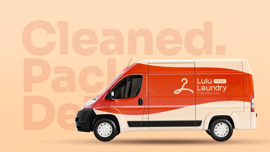
A complete identity system built to survive daily use carried from the logomark through to the delivery bag, the driver’s uniform, and the thank-you card in the envelope.
An expressive handwritten identity for a brand where style is the product bold enough to have a personality, clean enough to sell online.
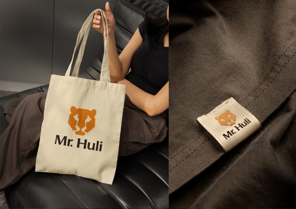
A fearless, minimal identity built around a geometric tiger mark, designed to work equally well on a garment print, a woven label, and a hang tag.
A credible, professional identity for a young technology company entering a category where trust is decided before the first conversation.
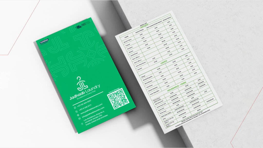
A clean service identity built for recognition at the doorstep, extended into brochures, price cards, and everyday customer collateral.
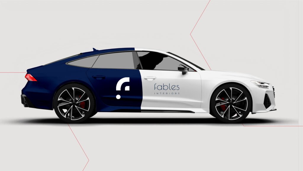
A refined identity for a business selling craft and taste, carried through to signage, collateral, and full vehicle livery.
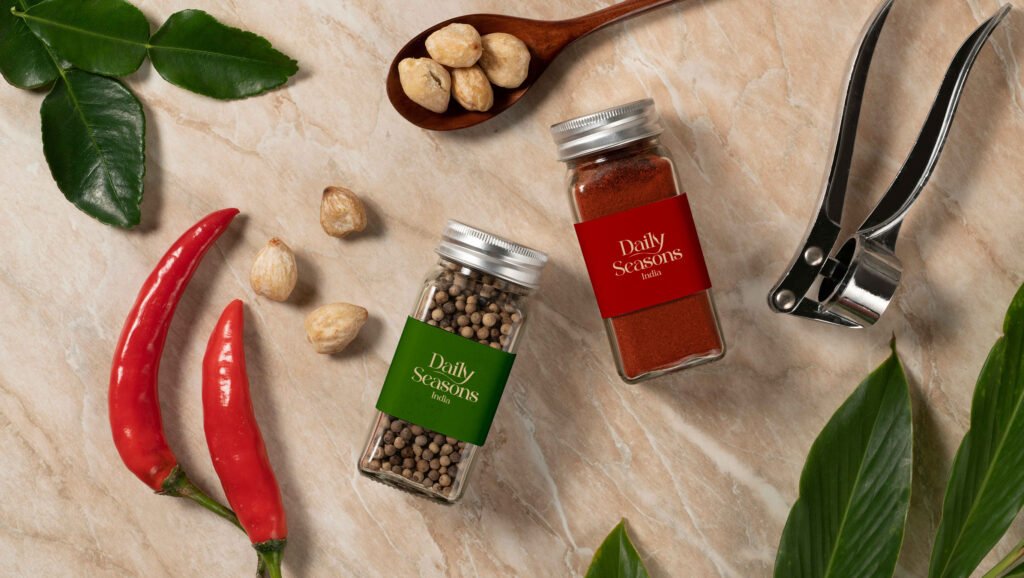
A warm, considered identity for a food brand that lives in the customer’s kitchen built around packaging that has to look right on a shelf and on a counter.
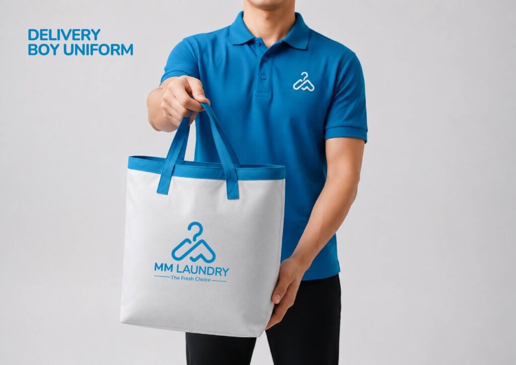
A distinctive laundry brand identity built to feel clean, reliable, and recognisable across vehicles, uniforms, packaging, and everyday customer touchpoints.
Laundry Service
WordPress
MM Laundry operates in one of Dubai’s most crowded service categories, where most competitors are visually interchangeable and the customer’s real experience happens at the door not on a website. The brand needed to be recognisable in a second, and hold up on surfaces most identities are never designed for.
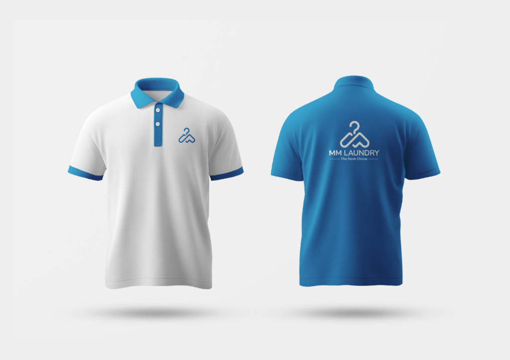
We built the identity around a single confident mark a hanger formed into the letterforms and a clean blue-and-white system that reads instantly at small sizes and long distances. From there we extended it into the places customers actually encounter the business: laundry bags, staff and delivery uniforms, stationery, thank-you cards, and a complete social media system with its own icon set and layout rules.
A brand that arrives at the customer’s door looking like the same business that ran the ad, built the website, and sent the message. Uniform across every level which is exactly where trust in a service business is won.
Fashion eCommerce
Shopify
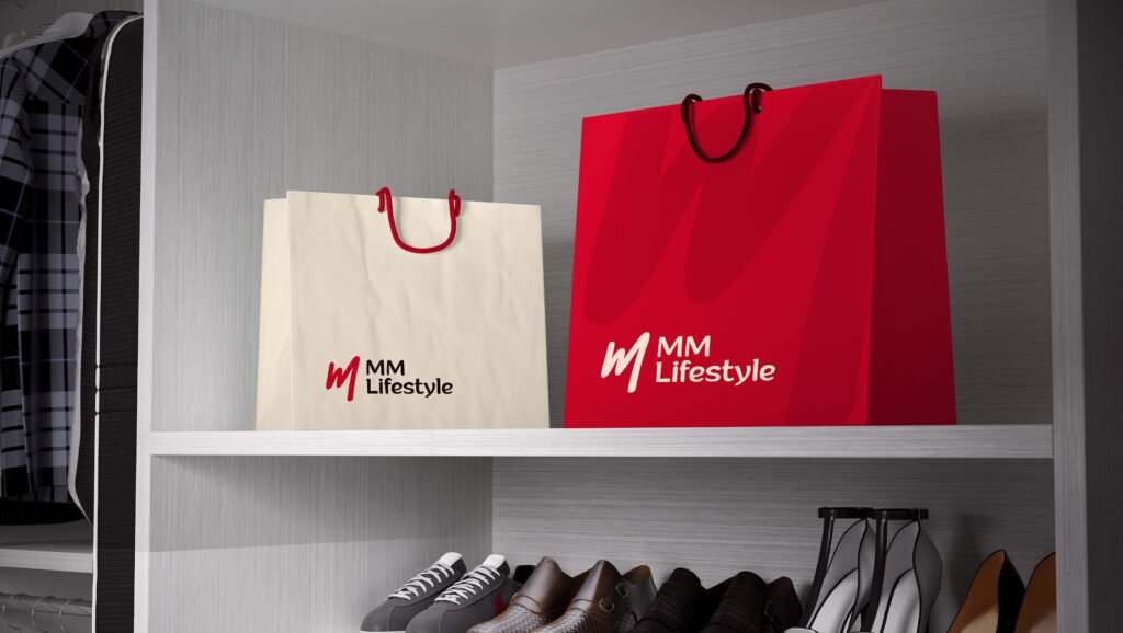
MM Lifestyle is a fashion eCommerce brand, and in fashion the identity isn’t a label on the product. It is part of what the customer is buying. The brand needed personality without losing the clarity an online store depends on.
We designed a bold handwritten mark that carries movement and individuality, balanced against a clean, readable wordmark expression paired with everyday practicality. The palette was built with intent: a warm ivory for depth and understatement, a signature crimson for confidence and energy, and a deep espresso base for a premium finish. Each decision was documented with its reasoning, so the brand could grow without drifting.
A brand book that gives the business a consistent visual language across the store, campaigns, print, and retail display and a brand that feels like something to belong to rather than something to buy from.
Fashion eCommerce
Shopify
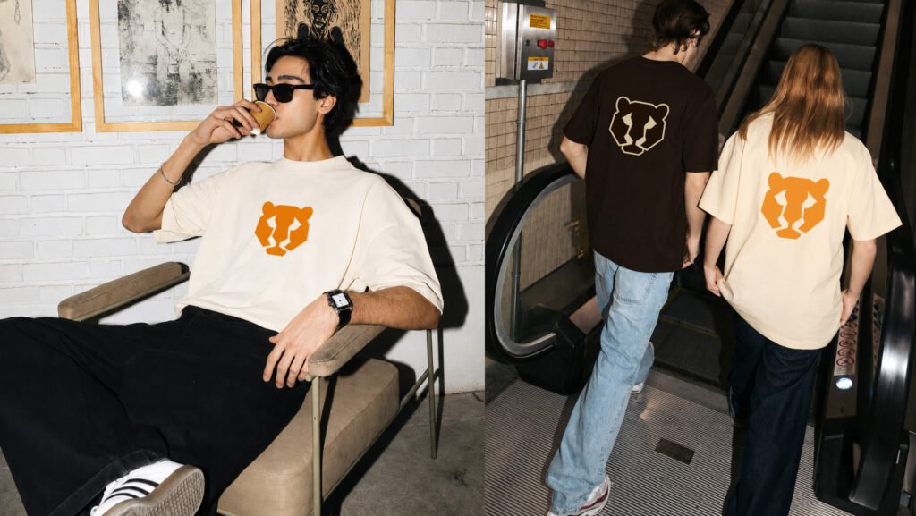
Mr. Huli was launching into Indian streetwear a category where customers buy the brand as much as the garment, and where a new name has no history to lean on. The identity had to carry meaning from day one, and work on surfaces most brand books never consider: a printed tee, a woven label, a hang tag.
The name comes from huli - tiger, so we built the mark as a simplified geometric tiger head rather than a detailed illustration, keeping it bold enough to survive being stitched, printed, and shrunk. The palette was drawn from the product itself desert beige, deep brown, and tiger orange with a condensed serif that gives the brand weight without noise. Every application was designed against real product formats.
A complete identity delivered before launch, with the tagline “Timeless by Design” — giving the business a clear brand to build its first collection around instead of designing products first and finding an identity later.
Most businesses come to us asking for a logo. Some genuinely need one. Many already have a perfectly good one and a problem somewhere else entirely.
What we usually find is that the logo is fine, but the website, the shopfront, the invoice, the delivery bag, and the social media page all look like they belong to four different companies. The customer meets one business and forms four impressions.
We’ve also learned that a brand is only as strong as its least considered touchpoint. It’s easy to make a presentation look beautiful. It’s harder and far more valuable to make the uniform, the packaging, and the thank you card carry the same weight. That’s where customers actually experience a business, and that’s where most brand work stops short.
So we build brands as systems, and we document them. Not because guidelines look impressive, but because they’re what keeps a business looking like itself two years later, after ten different people have used the files.
The first place most customers will experience the brand you just built.
Photography, video, and design that keep the brand alive after the guidelines are delivered.
Put the brand in front of the right audience through search, paid media, and social.
Align the brand with where the business is actually heading.
From laundry and home services to fashion, streetwear, retail, interiors, food, and technology, we’ve built identities for businesses across the UAE, Qatar, India, Spain, and New Zealand most of whom have stayed with us long after the guidelines were delivered
What’s included, what you’ll own and how long it takes, whether you’re starting fresh or building on the brand you already have.
That depends on where your business is. If you’re launching, a full identity saves money later redoing a brand after it’s already in the market costs far more than building it properly once. If you already have a logo that’s working, we’ll often recommend building the system around it instead of replacing it.
Yes. Every source file, export format, and guideline document is handed over to you. Your brand should never depend on staying with a particular agency.
Yes, as a documented guideline book covering logo usage, colour, typography, incorrect usage, and applications so anyone working on your brand in future has clear rules to follow.
It depends on scope. A core identity logo, colour, typography typically moves quickly. A complete system with guidelines and applications takes longer, because each application is designed for its real world use, not mocked up generically.
Often that’s the better answer. Many businesses don’t need a rebrand they need consistency across the places their brand is already being used. We’ll tell you honestly which situation you’re in.
We design every application to production standard and supply print-ready files.